|
#4
 04-24-2005, 10:12 PM
|
|||
|
|||
|
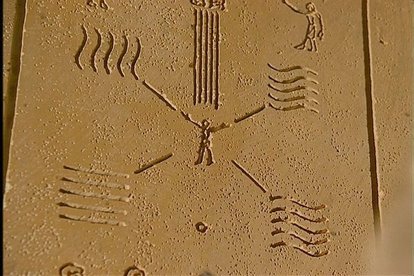
Have you thought about movieng the background pictures into different quadrants? For instance, Fire in the bottom left like it is, Earth in the top left, Wind in the top right, and Water in the bottom right.
I think it might give it an interesting look. 
|
|
#5
04-26-2005, 11:34 AM
|
|||
|
|||
|
I also noticed that the waves on your fire chip are going a different direction from the other chips. Was this intentional because the anal side of me would go nuts with this (unless you had all 4 going different ways)?
Love the pattern though!
|
|
#7
04-26-2005, 03:25 PM
|
|||
|
|||
|
yeah the symbols were different. Only fire was vertacle and earth was flat. The other two were the same but different colors I think.
all I could find with a quick search: http://www.themeworld.com/cgi-bin/search.pl
|
|
#8
05-09-2005, 04:09 PM
|
|||
|
|||
|
some new ideas over at chiptalk.net on the 2nd page.
not my work so don't feel right posting it here.
|
|
#9
05-09-2005, 04:17 PM
|
|||
|
|||
|
I hate the new designs and loved the older ones....
You're going to regret screwing these up with that craptastic typeface. The old designs were nice and clean....
|
|
#10
05-09-2005, 06:11 PM
|
|||
|
|||
|
This seems to be an image from the movie:
|
 |
| Thread Tools | |
| Display Modes | |
|
|


 Linear Mode

